
You can grow your blog in two ways:
- Get more traffic.
- Do more with the traffic you have.
In my opinion, you should do both even though most people focus on the first option.
Those bloggers don’t realize they’re losing a large chunk of their traffic before it even has a chance to convert.
One of the best ways to see how well you’re using your traffic is to look at your bounce rate.
The average bounce rate across all industries is about 45%. Bounce rates just for blogs are usually higher as illustrated in the image above.
But that’s just the average. Some sites have bounce rates in the 20s, while others have bounce rates in the 80s.
If 4 out of 5 visitors leave your site immediately, there’s a problem—likely multiple problems.
Compare that to a 20% bounce rate (1 in 5 visitors leaving without interacting). This lower bounce rate means that you would only need a quarter of the traffic of the other site to get the same engagement results.
There are many ways to improve your bounce rate, but in this article, I want to show you an underutilized way of reducing your website’s bounce rate and increasing all aspects of engagement.
The main problem is that you need visitors to take action to reduce your bounce rate. But people are notoriously passive on the Internet.
The 1% rule states that only 1% of forum users will actually post on a forum, while the rest will passively lurk:

We see the same kind of behavior on blogs, where typically about one visitor out of 100 will comment (depends on subject and article).
In fact, people behave like this in many settings, especially on the web:
News consumption is actually really passive, unless there’s some sort of virus going online, because it’s just whatever appeals to you in the fishbowl.” – Choire Sicha, The Awl
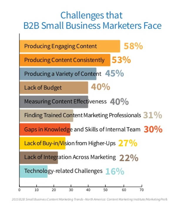
And it’s this behavior that marketers struggle to change. According to one survey, 58% of B2B marketers struggle to produce engaging content:
The reason why they struggle so much is that the Internet is a very different medium than other forms of entertainment, and most marketers are stuck in mentality of the past.
People have always consumed news passively on TV, but they had no choice in most cases other than to watch a show or even a commercial. With the Internet, there are always 100 other sites just a click away.
If you want engagement, you need to create an engrossing experience for your visitors. That sounds hard, doesn’t it?
It can be hard, but I’m about to show you how you can easily use interactive content to make your content much more engaging. If you put the tactics in this article into action, you can probably drop your bounce rate by 10-15% in most cases, or even more.
The psychology and science behind interactive content
Engagement and interactive content go hand in hand, and we’ve known it for quite a while.
Interactive education was originally studied at home and schools even before the Internet was a thing.
Let me define interactive education: Interactive education is teaching that requires participation from students.
Interactive content, as we’ll soon see, is the same thing—just swap out students for readers.
At first, researchers found that interactive teaching was effective at engaging students who were raised in hyper-stimulated environments. Hyper-stimulated environments? Does that sound like something else you know? (Hint: the Internet).
The reason that interactive teaching was studied in the first place is because the researchers determined that it led to higher engagement levels. To take it further, studies showed that higher levels of engagement led to deep learning.
Deep learning means that you’re actually understanding concepts and can use that knowledge later. Surface learning means that you’re just memorizing facts to pass a test.
Anyone who has ever studied for a test knows that surface learning doesn’t last. As soon as you finish writing the test—whoosh—that information evaporates from your brain.
When it comes to your blog posts, you want your visitors to gain a deep understanding of the topics you write about. For one, this makes you and your website more memorable. More importantly, your visitors will actually be able to apply this information and make their lives better. Guess with whom they’ll associate those benefits? That’s right—you.
Other studies of high school and university students have confirmed that interactive-engagement methods lead to better grades and retention.
One study looked at how clickers (those multiple-choice polling remotes) given to students and used during class affected students. It was found that frequent use led to deeper learning. I’ll be showing you soon how to use similar polls to boost engagement in your posts.
But interactive learning goes far beyond quizzes and polls. Studies have found that other types of interactive learning deepens learning just as much or more:
- creating case studies
- doing experiments
- student research
- team learning
Do you know what’s even more interesting? Games can be a form of interactive learning, and they work well.
Let’s get to the results, however, because that’s what you’re probably wondering about. A recent study on university students found that professors who use interactive teaching methods had double the engagement rate of other professors and had a 20% higher attendance rate.
Having a higher attendance rate in class corresponds directly to having your blog subscribers read your articles more often. Wouldn’t you want a 20% boost in your email update click-through rate?
Teaching on the web is finally being implemented, and it’s catching up with traditional interactive learning. But bloggers and marketers are adopting it slowly, so you have a chance to get ahead of the curve.
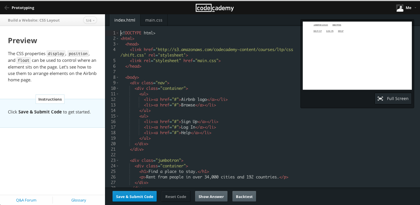
One example is Codecademy. Every lesson involves you learning a programming technique by completing a task. It is incredibly engaging and effective at teaching beginner programmers:
The reason leading blogs are sold on interactive content
Like I said, blogs are playing catch-up here, but some have already recognized the potential of interactive content.
In general, audiences can either be active or passive.
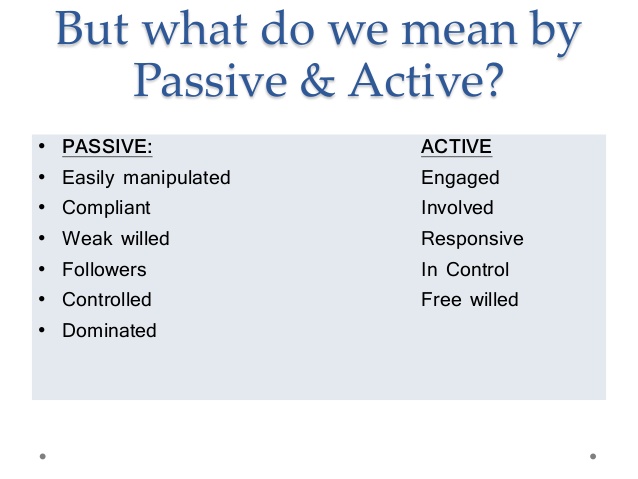
The Internet is a bit weird because users actively choose what content they’ll consume, but most of that content is set up for passive consumption.
This is why visitors don’t get as much from your content as they should and why very few ever take action.
You need to create a situation where your visitors both actively choose to read your content and also actively consume it, meaning they take some kind of action.
We’ve talked about the main benefits: your readers will learn more, and you’ll become more memorable.
That alone should be sufficient motivation, but there’s actually more to it.
You can use interactive content to learn about your readers.
For example, if you embed a tweet somewhere in your content, you can see which of your readers not only read that far into your posts but also liked it enough to share it. These are your best readers.
In addition, if you take some sort of a poll, you can use the results to learn more about what your audience thinks.
Or what about a short pop quiz? See if the majority of your audience understands what you’re teaching. If they’re not, how could it possibly help them? It gives you a chance to refine and improve your writing.
That’s enough about why you should be using interactive content. Now I’m going to show you 7 different ways to implement it on your website.
1. Social media is for lazy busy people
People love to share content as long as it doesn’t take much effort.
Every day, over 500 million tweets are being created. They are a maximum of 140 characters and don’t take much effort.
The more you can remove friction by integrating sharing functions with your content, the higher your engagement rates will be.
At first, there were browser plugins that made it so that you didn’t even have to visit the social network to share something.
After that, came share widgets, which are still pretty effective.

But sharing widgets are still a bit disconnected from the content and require people to both choose which social network they want to share the content on and craft a description.
But there’s a way to erase the border between content and sharing to make it extremely easy for readers to share: embedded social media.
Look at this embedded tweet on a Crazy Egg blog post:
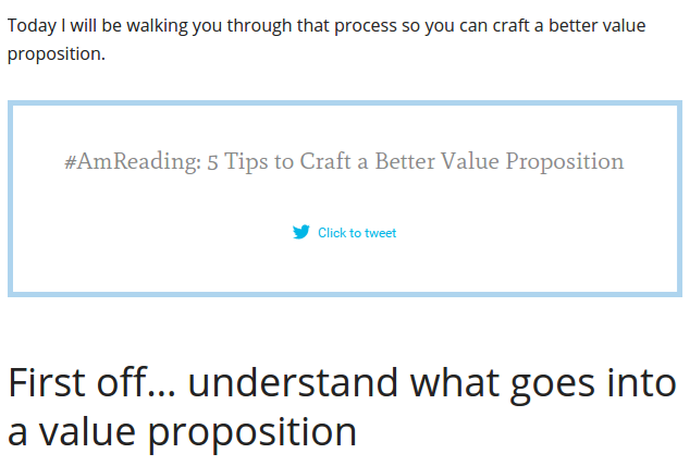
It actually improves the look of the content. In addition, it’s at an appropriate point in the content, and readers can tweet the pre-filled message with one click.
I’m going to show you how to embed social media content from the biggest social media networks. However, if you use a smaller network heavily, there is probably a way to embed that content as well if you dig around a bit.
How to embed tweets
The simplest way to do it is to use Twitter’s embed function. This is a perfect way to showcase your tweet. It allows readers to follow you or engage with that particular tweet without leaving your website.
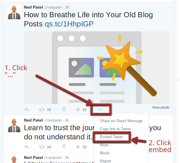
To start with, find the tweet you want to share. Click on the “…” button.
Once you click “Embed Tweet,” a pop-up will give you the embed code. Copy the HTML, and paste it on your website. Once you do, it will show up in your article like this:
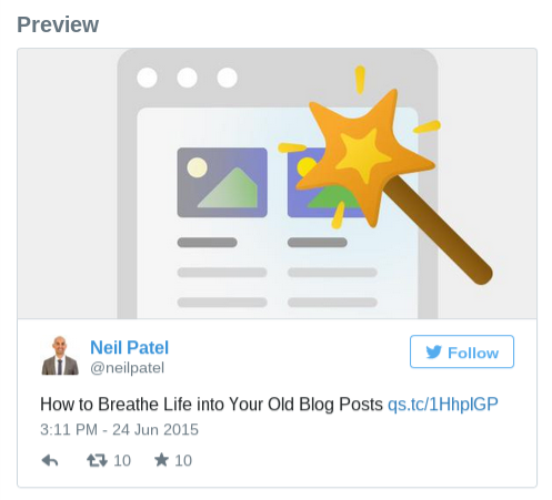
The drawback of that method is that you’re limited to one tweet. What I prefer to do is use a plugin like TweetDis (which we use on Crazy Egg) to create beautiful custom tweets.
You can create any message and use the plugin to highlight it. A reader can then click on it to tweet it. I like to include a relevant username (e.g., @neilpatel) in the message so that I can track them.
You can also create multiple tweetable bits throughout your article.
Once you have the plugin installed, highlight some text in your article that you would like to use as a tweet, and click the icon in the text editor bar:

A window will pop up with your options:
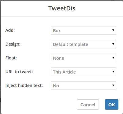
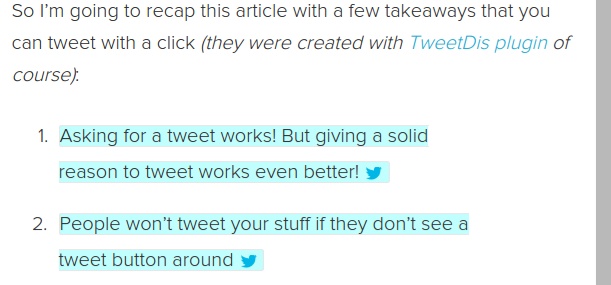
Under the “Add” dropdown menu, pick which kind of embedded tweet you want. A “Box” will give you a full box like I showed you at the start of this section. In addition, you can also pick a “Hint,” which highlights the full sentence instead:
How to embed Facebook posts
For niches dominated by Facebook, embedding a post can get you extra comments, likes, and shares.
I haven’t found a good plugin for WordPress, so you’ll have to stick with the default method that Facebook gives you.
Find a post that you’d like to embed, then click the little down arrow in the top right corner:
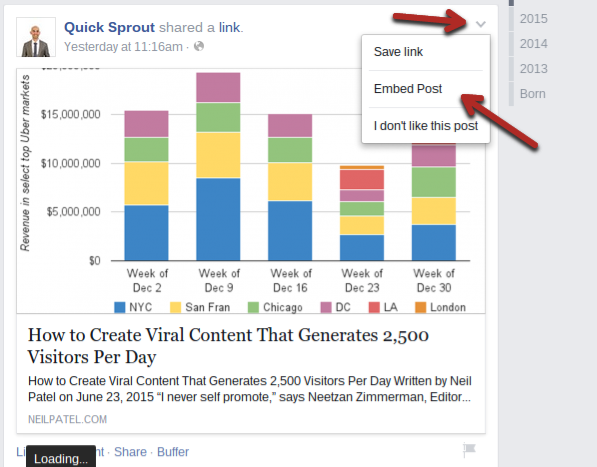
Once you click the embed option, a window will pop up that gives you the HTML code you need to embed the post.
Once you put that code on your site, this is what it will look like to your visitors:

They can like, comment, or share the post, and they can also like your page without leaving your site.
You’ll notice that this procedure is very similar to embedding content from Twitter on your site. In fact, almost all social networks are the same, so just look for an embed option in a dropdown menu on a post on any other network you’re interested in.
2. Pop quiz time
Quizzes are one of the oldest forms of interactive content, right up there with simple calculators.
While some marketers may feel that quizzes have been overdone, they still work really well.
In a study of 100 million articles in 2013-2014, it was found that eight out of the top 10 most popular pieces of content were quizzes.
This was number one: “What Career Should You Actually Have?”:

Not only do people like quizzes, they also love to share them to show their friends who they are, what they care about, and, of course, how cool they are.
Coding a quiz from scratch would be fairly time consuming, but there are many quiz tools you can use.
For example, you can use Qzzr to design a quiz, which will give you an HTML code to copy and paste in your article—that’s it.
Here’s what the backend looks like:
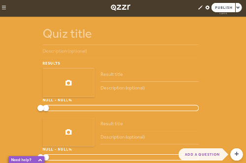
You have a ton of options: you can create text or image answers for each question. Your quiz can have as many questions as you like.
Once you’ve set all your questions and results, you’ll get an embed code to paste on your site. Then it will look something like this to the visitor (“Which Iron Man armor suit are you?”):

To make it even easier for many of you, there are also quiz plugins for WordPress such as SlickQuiz, which is also free.
You can make the quizzes right in your admin panel:
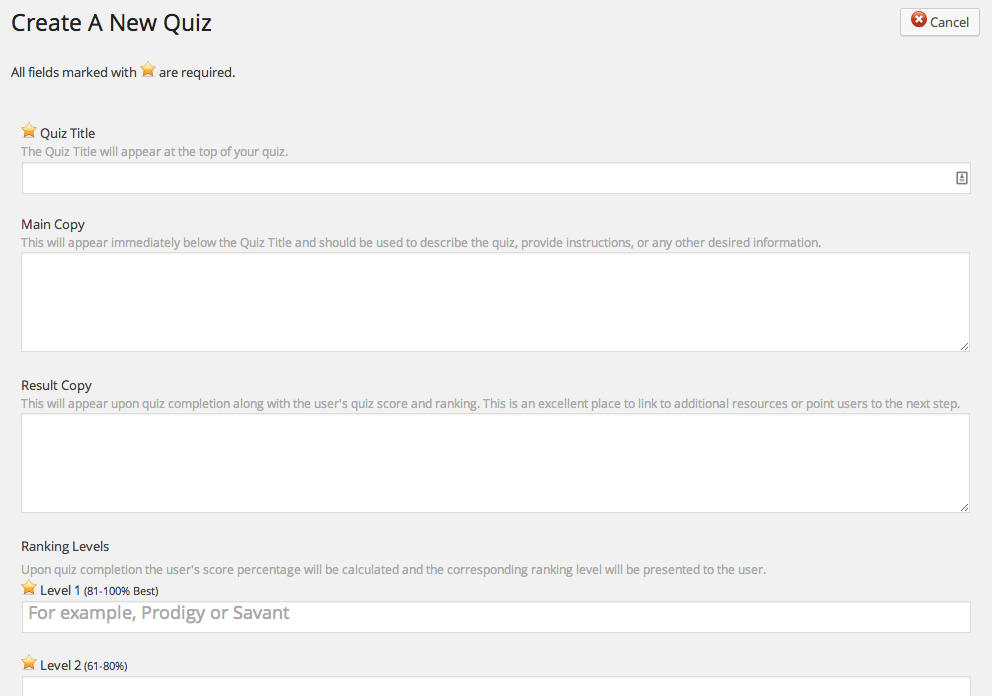
You won’t have quite as many options, but you can still get started with testing your quizzes. When you’re done, you just use a shortcode to embed the quiz on your site:
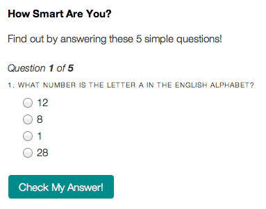
Once your visitor completes the quiz with either tool, they will see their result and have a chance to share it on popular social networks such as Facebook and Twitter.
Now, Iron Man suits are fun but not very useful from a teaching perspective, which is what you want.
I recommend putting quizzes in the middle or near the end of the post, and using them to test your readers’ knowledge. It’s a great opportunity to reinforce a key teaching point.
Secondly, make the question and result useful. Don’t ask a basic or irrelevant question. Ask something that will force your reader to think about and apply the information in your article.
For example, let me ask you a question. Which one of these would be the most appropriate question if I were to include a quiz right now?
- Is interactive content good?
- Which of the following is not a benefit of using interactive content in blog posts? (multiple choice answer)
- Is Iron Man cool?
Question 1 is too basic—you could answer it just based on the title of this post.
Question 3 is irrelevant to the overall teaching points.
Question 2, however, forces you to think about what engagement leads to. The sample answers might be:
- more return visitors
- more comments
- better search rankings
- higher time spent on page
If you’ve read and understood everything up to this point, you’d be able to figure out that “better search rankings” is not a benefit of using interactive content.
3. How to lower your form abandonment rate
At one point or another, I am sure, you’ve filled out a long form, clicked “submit,” and then gotten an error saying you missed something. What’s worse is when you have to re-enter your data.
Most forms are terrible. They fulfill the basic functional requirements and nothing else.
That’s why I really liked Typeform when I first came across it.
This tool allows you to create highly customized forms. You can ask questions or request information and incorporate all sorts of form elements. They look great and function perfectly.
Additionally, you can create forms that are engaging because you can insert them in the middle of a sentence.
Put all these features together, and you get highly interactive content whether it’s on your blog or somewhere else on your website.
Over the course of a month, Typeform records 5 million form submissions with a completion rate of 59%. In comparison, other form tools get between 3% and 28% completion rate.
Let’s look at how you can create a form.
Start by creating an account and clicking on the “create new form” button.
You can either start from scratch or choose one of the many templates:
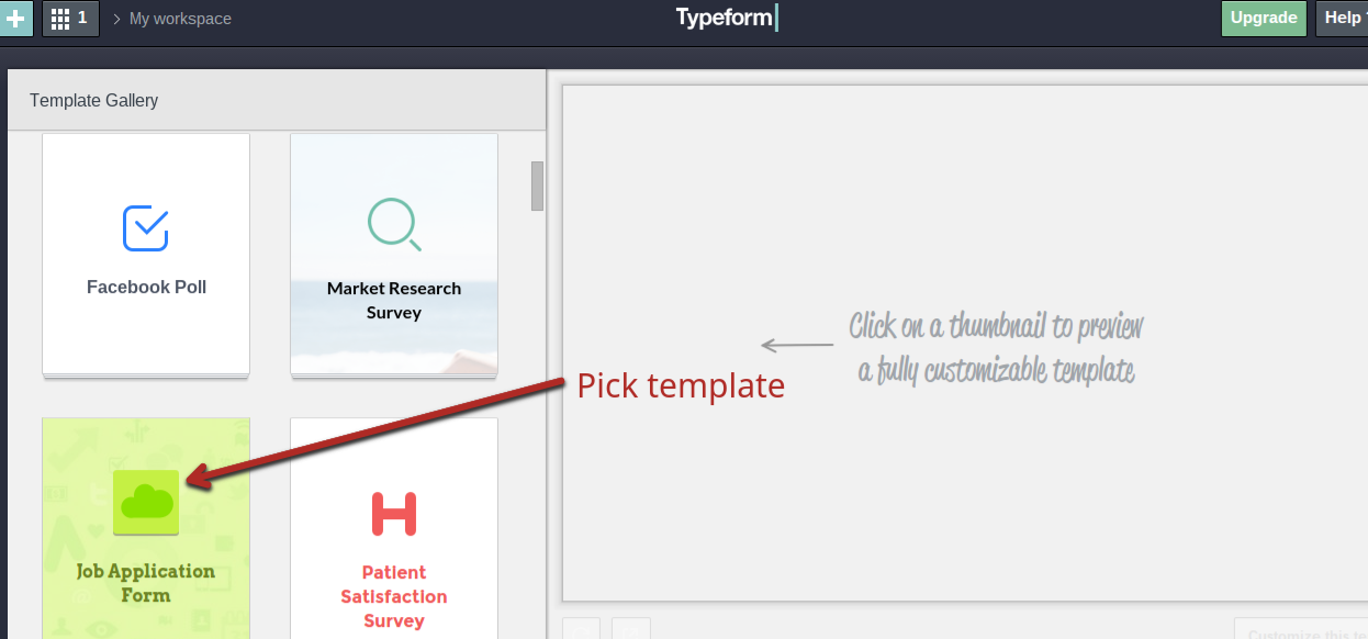
Once you’re inside, drag and drop different elements to your form. You can include text, questions, scales, pictures, or ask for answers from your visitor.
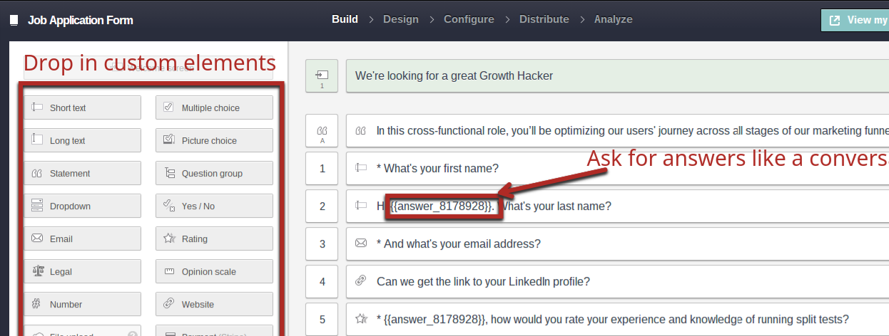
Your next step is to pick a design and some simple settings. Once you embed it on your site, your visitors will see something like this:
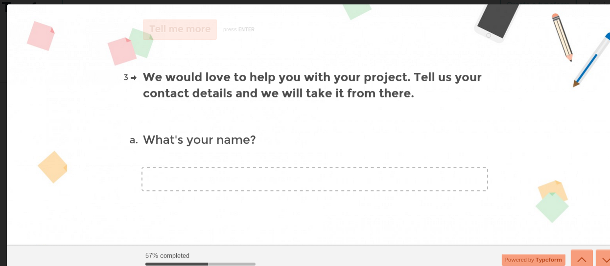
You can walk through actual examples here.
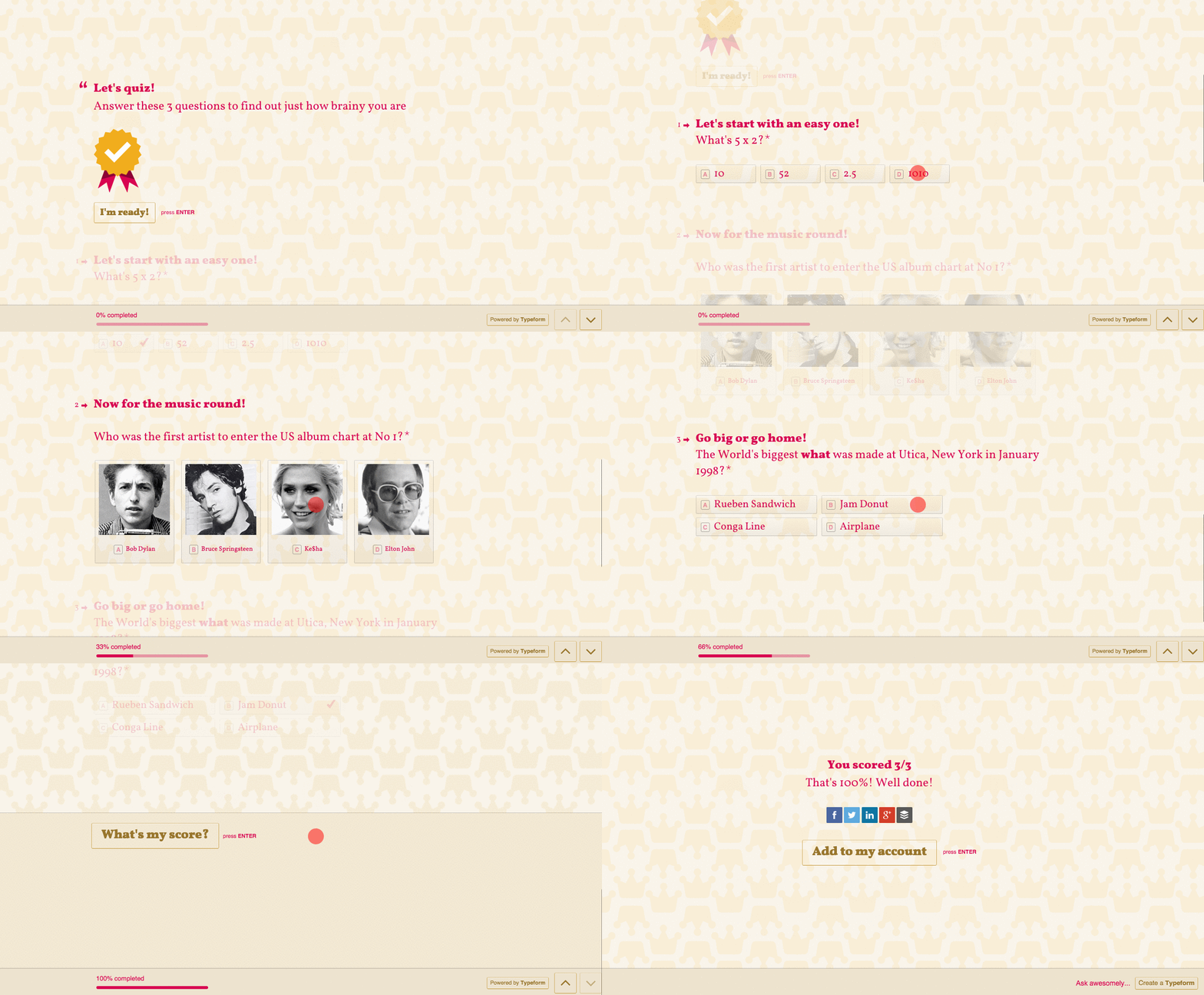
As as bonus, you can even use Typeform to make quizzes if you didn’t like the other options I gave you earlier:
4. Make your content fun with polls
Polls are highly related to quizzes.
You ask a question, typically with a few definite answers, and results are tallied based on input by visitors.
Polls are great when you’re trying to find out what your audience cares about or thinks about a specific topic.
The most attractive poll tool I’ve seen is ContentTools Poll. What your visitors will see is a simple poll, and when they click on an answer, they will see the results and buttons to share the results:

It is a paid tool, but you can start with a free trial.
Alternatively, there are many other poll tools out there. Two of the most popular options (both work with WordPress) are PollDaddy and Wedgies.
Almost all of them work the same. You simply type in your question and answers, and drop whichever elements you’d like into place:

After you do that, you’ll just need to copy and paste the HTML code to your website, or use the shortcode that the WordPress plugin gives you.
When your visitor clicks on an answer, they’ll see the results and share buttons as expected.
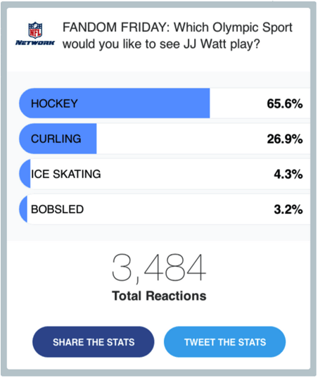
There are lots of options to create polls—that’s the easy part. The harder part is using them effectively.
Don’t just create polls for the sake of engagement. Create them so that you can learn about your audience.
For example, I could create a poll for this post that would ask you which type of interactive content you are most likely to use on your website. Based on your most popular answers, I could create further content. If 77% chose quizzes, I would create a step-by-step guide to creating quizzes. Alternatively, I could write an in-depth post about the psychology behind quizzes and engagement.
You could also use the answers to monetize your site. Once you learn which topics your audience is most interested in, you can create products around those topics.
5. Which is better: long or short content?
If you’ve ever been to Quick Sprout before, you’d notice that I like long content.
Writing longer content helps get extra search traffic, but more importantly, it allows me to go into great detail on a particular topic and include lots of examples.
It works for me, but it doesn’t work for everyone. In fact, the top two reasons why people don’t read content are related to content being too long:
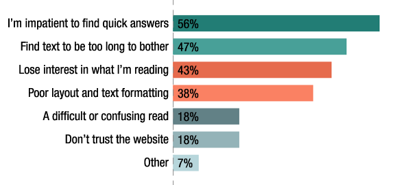
Even some of my readers complain that my posts are too long sometimes.
If you want to give your readers more control over your content, you can use hypotext. Essentially, you create links in your content, but instead of opening a new window or tab, they open a hidden section in your content.
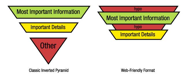
Hypotext allows you to hide extra information that only a portion of your readers might want.
When that text is compressed or hidden, only essential text will be visible on the page.

Here’s what happens when someone clicks a hypotext link:
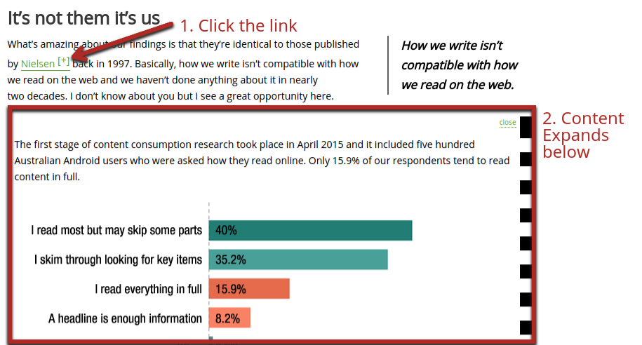
A section expands just below the paragraph of the link clicked with all the content that you’ve hidden. You can hide:
- detailed explanations
- more examples
- more research
- pictures
The other bonus, in addition to giving readers more control, is that it also engages them. They decide for themselves if they want to learn more or explore the content deeper.
If you want to try hypotext, start by installing this WordPress plugin.
Then, when writing your article, wrap the text you want to serve as the link with shortcodes, e.g,:
[hypotext target=”your-target-id”]your link text[/hypotext]
Then, wrap another shortcode around the text you want to be hidden:
[hypotext id=”your-target-id”]the hidden text[/hypotext]
Make sure that the target name and id name are the same, or it won’t work.
6. Take infographics to a whole new level
Another type of content I love is infographics. They can still be used to drive over 60,000 visitors per year to your website.
I’m not the only one who likes them. Just under 80% of marketers use and share infographics sometimes or frequently.
Infographics are great, but there are two minor problems with them. First, they’ve saturated the web. Even high quality infographics don’t produce the results they used to. Secondly, they aren’t engaging. Infographics are typically skimmed, and then some viewers might share them or leave a comment.
But what if you could make infographics into a story that involved user interaction?
Here’s a screenshot of an interactive infographic that was created by GOOD and Deeplocal:

It shows the number of small businesses each state has. When you move the mouse across the picture of the United States, different states are highlighted, and their stats come to life.
In addition, the “home” page of the interactive infographic allows you to choose what you’re most interested in. The first option takes you to the map, but there are several other interactive screens you can choose.
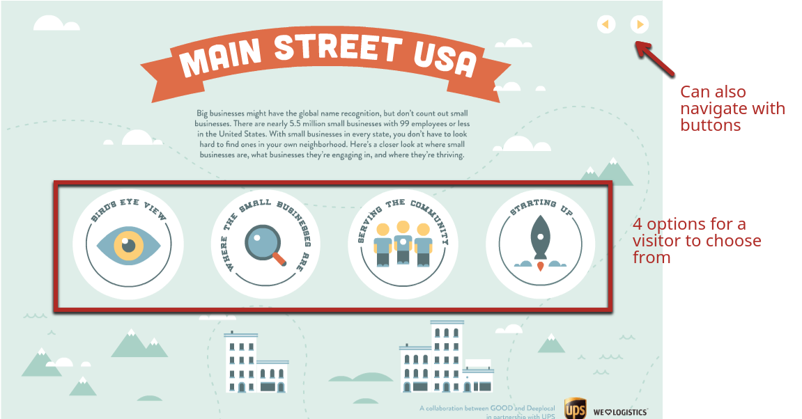
This type of infographic forces people to read and explore rather than scan. I shouldn’t really use the word “force” because most people will find this fun.
Here are nine more such infographics if you would like more examples.
The catch is that interactive infographics are not easy to make, which is part of the reason they won’t be widespread anytime soon.
There’s no easy tool that lets you make them (although if you could make a good one, you could make a killing).
You can create them yourself using software like Adobe Edge Animate, but it’s far beyond my design skills.
If you’re interested in creating one, I suggest posting a job on Dribbble or a freelance platform like Upwork (formerly oDesk).
7. Choose your own adventure with videos
Video marketing is getting more popular.
People love videos because it’s just like watching TV.
The problem, as we’ve seen, is that passive viewers don’t take nearly enough action.
If you use video ads or incorporate videos in your content, you might want to think about making them interactive to improve engagement.
Most of us are familiar with those “choose your own adventure” books we read as kids—they were fun. You had a choice of two pages at the end of each page to customize your story as you saw fit.
Similarly, you can let your viewers choose their own adventure.
In a Philips video (the shaving company), there’s a short intro of a guy who had a wild night that, he says, “started with shaving.” You get to pick the style of his facial hair at the beginning of the night and see a different video depending on your choice.

For a product video, you could let your viewers choose which aspect of the product they care about (features, manufacturing, company background, etc.).
If you have a video editor (an actual human), he or she will probably already know how to create a video like this. For regular marketers, it’s not exactly easy. You’ll need to use a tool such as Vidzor or Rapt Media to create videos like the example above.
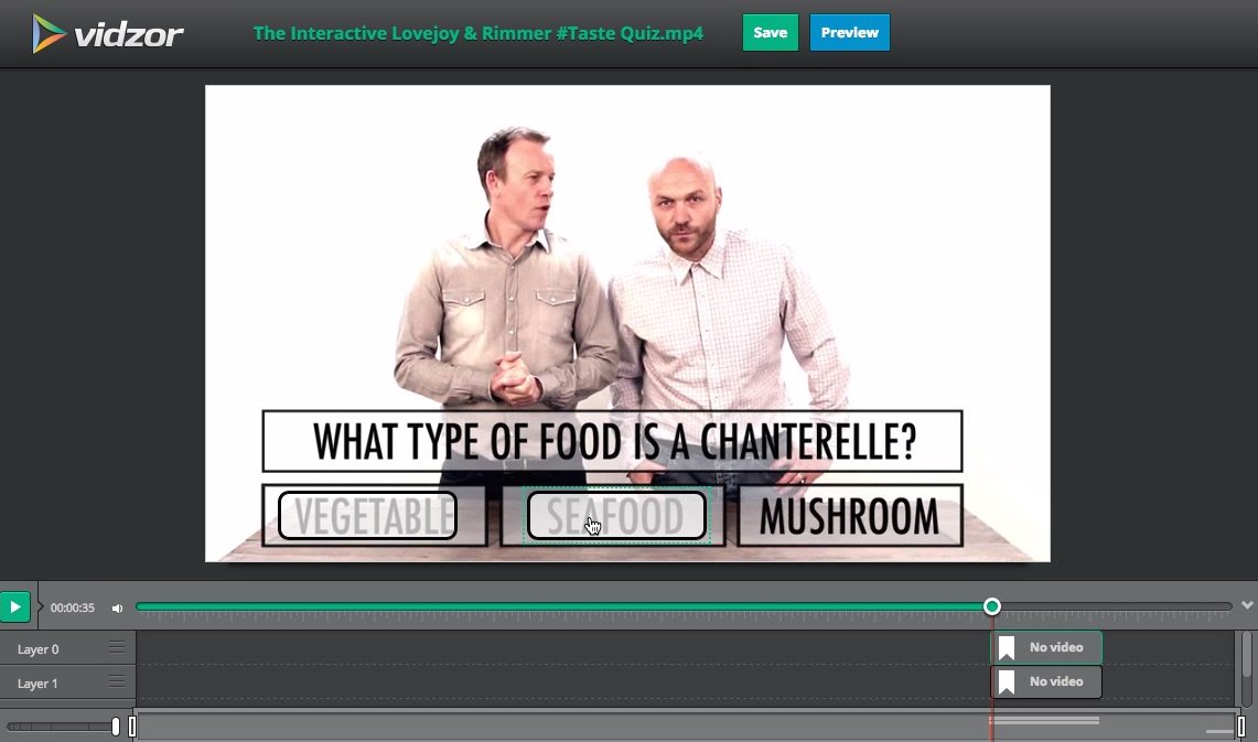
One simple option is to simply use YouTube annotations. You can use these to let viewers navigate to other videos. Sure, it won’t be as fancy as a professional option, but it’s a good way to test if you’d like to start creating interactive videos in the future.
Here is a complete tutorial on creating annotations on YouTube videos:
Your viewers should see clickable annotations pop up on the video at specified times:

It’s up to you where those annotations direct them to.
Conclusion
Interactive content is a huge opportunity that’s still in its infancy. If you ever wished you discovered something before everyone else adopted it, this is it.
You probably noticed that not all types of interactive content is easy to create. I don’t recommend you try to create all of the types at the same time. Pick one or two that fit well with your audience and website, and focus on perfecting those.
What you should see, once you start creating interactive content your readers are interested in, is a much lower bounce rate, higher time on page, and a significant bump in the number of shares and comments you get.


