Credit: Jerry Hildenbrand / Android Authority
TL;DR
- Google Wallet’s new stacked card design is facing criticism from users now that it’s rolling out more widely.
- A major complaint is that multiple cards from the same bank can look identical because the stacked view doesn’t show identifying details such as the last four digits.
- Some users also say switching between their most-used cards now requires more actions than with the old horizontal carousel.
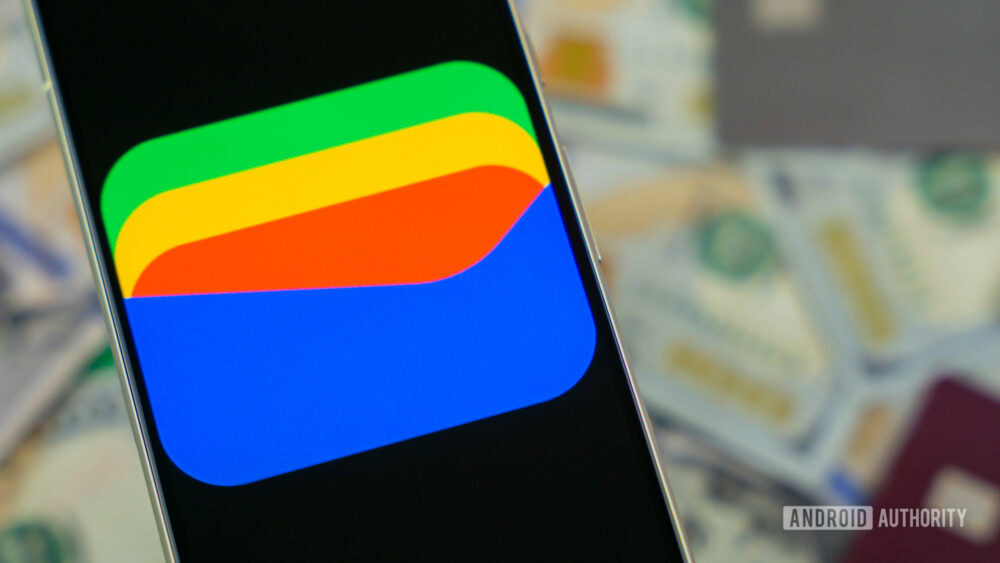
Google Wallet’s new card redesign is reaching more users, but the wider rollout has exposed a pretty annoying usability problem.