Credit: Joe Maring / Android Authority
TL;DR
- Google Messages v20261030 beta introduces a redesigned app icon featuring a rounded speech bubble and a blue gradient.
- The new look replaces the minimalist, interlocking flat pill design and aligns the icon with gradient icons for other Google apps.
- The updated icon is live for beta testers, though a stable rollout timeline remains unconfirmed.
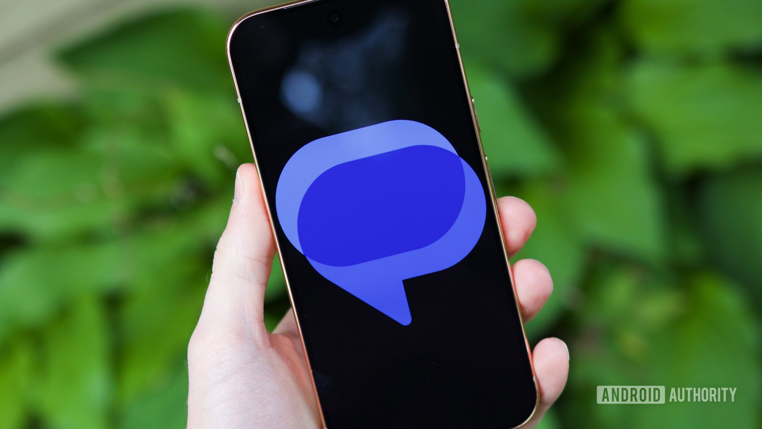
Alongside an overhaul of Google Messages’ settings, Google appears to be preparing a fresh coat of paint for the app icon of its default texting app. The latest Google beta comes with a new Google Messages icon, complete with the newer gradient look that aligns it better with other recently redesigned Google icons.
The current Google Messages icon relies on a flat, minimalist aesthetic: two interlocking horizontal pill shapes in contrasting shades of blue, forming a third overlapping tone in the center. It is clean and modern, but distinctly abstract and screams “messaging app” in the right way. You can see it in the image above.