Your about page is the most important page on your site.
It might not be the first page people visit, but it’s the page they’ll use to decide if they like you, trust you, and whether they’re coming back again.
And yet most businesses still have about pages that are boring, lack personality, and don’t offer visitors any value.
People like to buy from people they like, and your about page is the BEST page on your site to connect with your audience and show them how nice you are.
In this guide, we’ll break down how to create an about page that works, what to avoid, and take a look at sites that do it well.
The Easy Parts of Creating an About Page
The easiest part of creating an about page is sharing your brand story.
If you’re proud of your business, you naturally want to share that with the world. And on your about page, you get to talk about your journey to success, how great your business is, and show off all the praise you’re getting from others.
Another part of an about page that’s easy to nail is sharing social proof. Once you have a glowing testimonial or review, you can just add it to your about page. It doesn’t take much work, but it will boost your conversion rates.
This is especially easy if you automate your testimonials, so you don’t even have to upload or find them yourself.
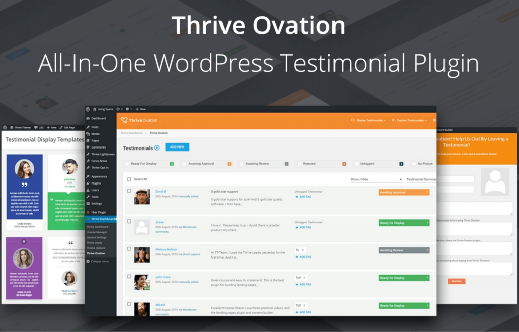
Using a plugin like Thrive Ovation, which can pull testimonials directly from your web forms or social media, makes it easy to automate social proof and testimonials. You can manage them from one dashboard in WordPress and update your page regularly with new testimonials.
The Difficult Parts of Creating About Pages
As fun as it is to share your story and your success, you have to keep your ego in check.
One of the hardest parts of creating an about page is not making it about you.
It sounds counterintuitive–surely an about page is THERE to tell people about your business, your mission, your brand? Well, not exactly.
Your about page exists to tell people about what you can do for them. As a general rule, people only care about themselves. What’s in it for me? How does this benefit me?
Finding a balance between establishing your brand and focusing on the customer is the real secret to a successful about page, but it isn’t easy.
Let’s look at what steps you can take to make sure your about page converts visitors, boosts your credibility, and helps you stand out from your competitors.
Step 1: Know Your Audience
You should have a detailed and clear demographic in your head when you write anything on your site, and that includes your about page.
Connecting with your audience and making them trust you requires a deep, deep understanding of what they want. And to understand what your audience wants, you need to do a little market research.
To be able to show your audience you can solve their problems, you need to:
- Know exactly who they are, what they want, and what they like
- Find voice of customer (VOC) data to help you when you draft your copy
- Get crystal clear on your unique sales proposition (USP) and offer
Let’s dive into how you can get into your audience’s head:
Research your Target Audience
Start by getting a clear understanding of who your current, or future prospects are. Are they female or male? Old or young? Working or unemployed?
The more you understand who your audience is and how they think, the easier it will be for you to write an about page that connects with them and makes them resonate with your brand.
Spend some time looking at where they hang out online, what kind of work they might do, and which social media platforms they use. Look at forums and Facebook groups to see which problems they have and which questions they ask.
If you want to know more about analyzing your target audience, this guide is a great resource.
Use VOC Data to Draft Your Copy
VOC Voice of Customer (VOC) data is the copywriting secret to success.
VOC data is information that your target audience is GIVING you about what they want and how to convert them.
You can find VOC data through reviews, forums, social media, and keyword research. The aim of using this kind of data is to find patterns that show you customer pain points and to use these to show your audience you understand them and can fix their problems.
You can also use VOC to structure your copy by repeating customer complaints back to them to build a connection.
Here’s how Proactiv does this on their about page:
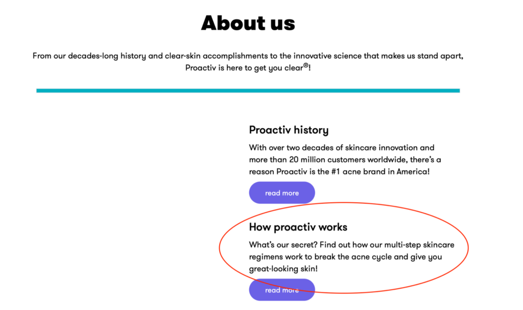
They use words like “acne cycle” and “great-looking skin” because they know that’s what their customers struggle with.
Get Crystal Clear on Your USP and Offer
Your about page is the perfect place to show visitors how you’re different–what your unique service proposition (USP) is. What can you offer them that no one else is? What gap in the market are you here to fill?
About pages aren’t just for sharing your story–they’re for sharing your offer without sounding too salesy. Look at this example from Kiki at The Blonde Abroad:
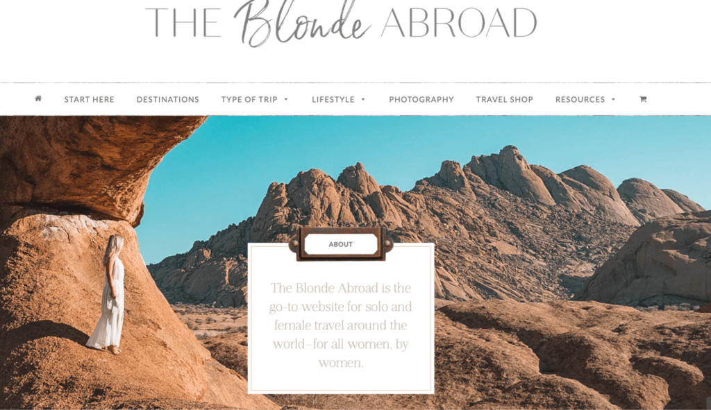
The travel blogging niche is pretty competitive, so Kiki’s set herself apart by focusing on solo female travel.
It’s clear who the blog is for and helps her pull in the right audience and stand out from the crowd.
Step 2: Writing the Copy
The next step of creating an about page is writing the copy.
The copy on your about page is crucial to branding. It’s how your audience knows whether or not they like you, and whether they trust you.
If you’re a small brand or an individual, like a blogger, this is your chance to connect with your audience on a personal level. If you’re a big business, this is your chance to humanize your brand.
It can be a little bit daunting trying to figure out where to start. But, there are a few tried and tested formulas to help you structure your page in a way that converts.
Generally, all about pages have the following components:
- Headline
- Intro
- Story/ Mission
- Authority/ Proof
- Call To Action (CTA)
Here’s how you can structure your about page to convert visitors and boost engagement:
Add Your Headline
Copywriting legend David Ogilvy once said that 80% of people only read the headline. This means that you have one sentence to showcase your brand to 80% of people.
Let’s take a look at Google’s about page headline:
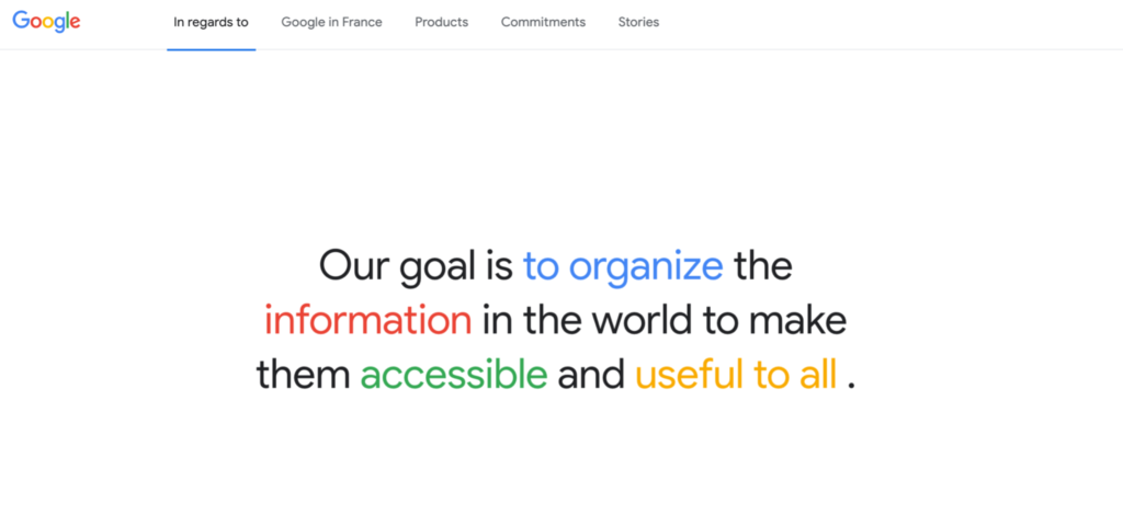
The headline ticks three important boxes; clarity, feature, and benefit.
We know what Google does (they organize information) and we know how it helps users (makes information accessible and useful)
Your headline needs to be concise, clear, and show the benefit or brand. You have one sentence to convince your audience to read on, so make it good!
Add Your Intro
If your heading grabs your reader’s attention, your intro is designed to keep it. You need to tell prospects what you do, why you’re different, and why they should stick around – all in a few sentences.
Your intro should include your mission, what you do, and your USP – all while showing your personality. It’s also a chance to include important information that didn’t fit into the headline.
Let’s take a look at Copywriter Alex Canttoni’s about page:

In her headline, she’s shown her personality and told us she’s an entrepreneur and writer.
But in her intro, she’s given us her mission, explained exactly what she does and the benefit it brings her clients (“messages that matter”).
Your intro and heading need to be short and sweet, so that, like Alex’s, they fit above the fold (the part of a webpage that’s visible without scrolling).
Most people have an attention span of 8.5 seconds, so make sure that you share the MOST important information in the intro and header.
Write Your Story
Your story is the one place on your about page where it’s good to talk about yourself.
However, for an about page that converts, you need to talk about yourself strategically. This means that your story needs to resonate with your audience and show them how you can help them.
Take a look at Brian Dean from Backlinko:
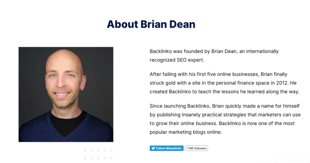
Brian uses his story to show authority, share his mission, AND connect with his audience.
He doesn’t just tell us about his success – he tells us about his failures. This shows his audience that he’s just like them. He understands their struggles, which means he understands how to help them.
Here’s another example from Jorden at Creative Revolt:
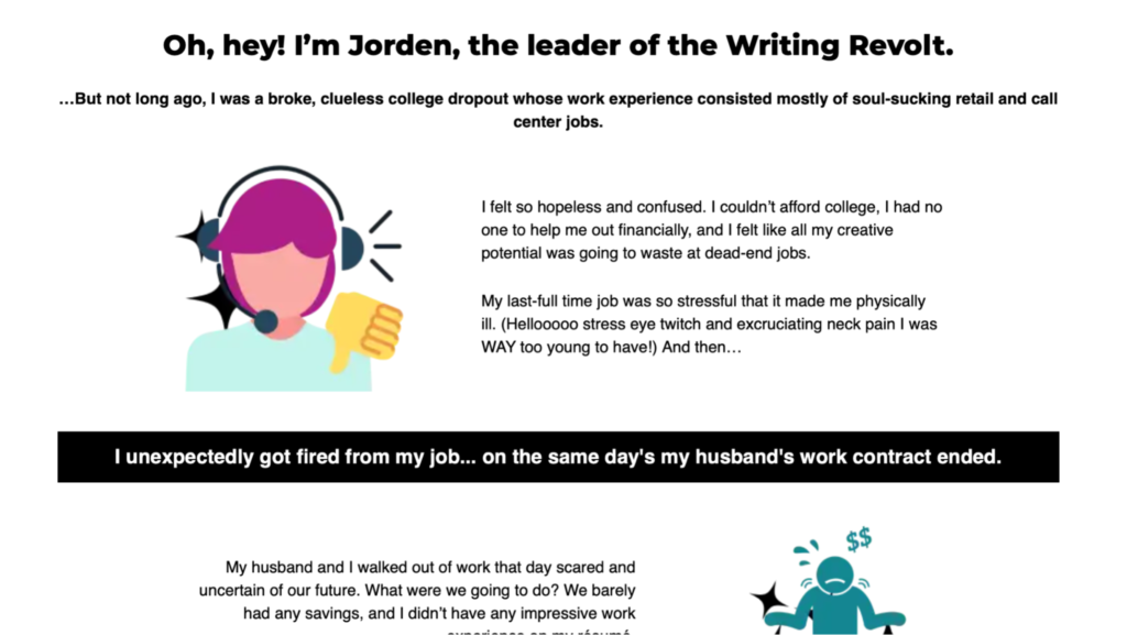
Jorden uses her story to REALLY show her personality and establish her brand.
Unlike Brian, who keeps it pretty formal, she uses humor, slang and gets personal with her story. This makes her relatable and real to her audience and makes it easy for them to trust and to like her.
When you’re writing your story, use the VOC data and market research to show your audience you’ve been in their shoes and you know how to help them.
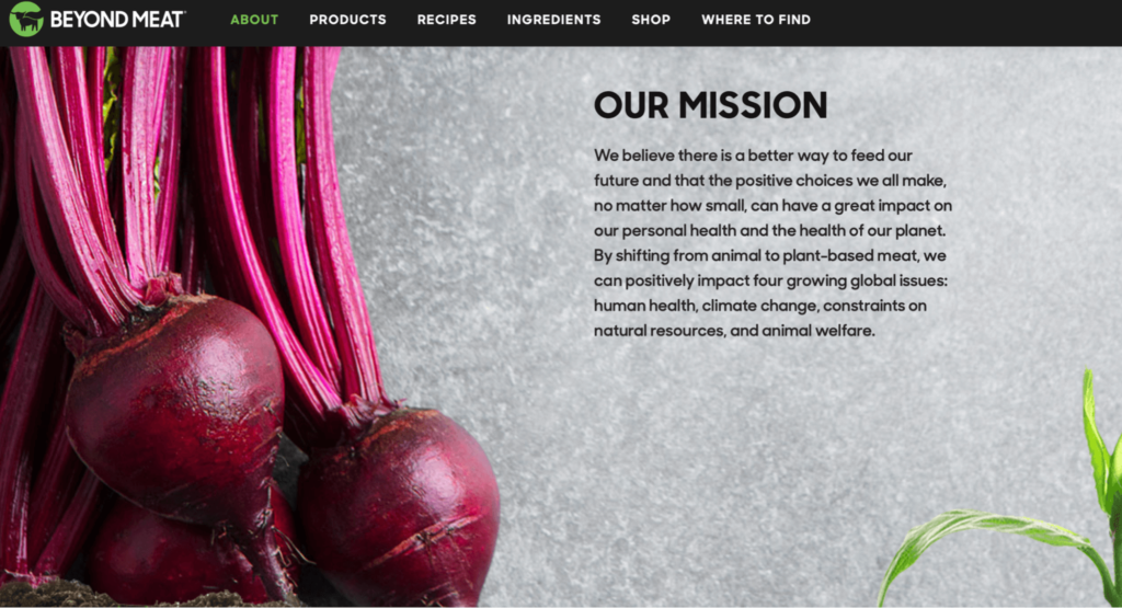
If you’re a bigger business, with multiple employees, it might be harder to share a personal story. Instead, you can focus on your mission.
You can still talk about what inspired the business and how it got started, but your connection with your audience comes more from a shared ideology than a shared experience.
Beyond Meat does a great job of this on their about page:
Add Your Authority/ Proof
This part of your about page is where you finally get to brag about how great you are.
Showing brand authority – be that through credentials, testimonials, partnerships, or sales figures – is the best way to convert visitors into customers.
You’ve laid the foundation for them to trust you and connect with you, and this is where you prove to them that you’re the real deal.
The kind of authority you showcase will depend on the size and structure of your business, but these types always get great results:
- Testimonials
- Reviews/ social proof
- Articles you’ve been featured in
- Credentials and qualifications
- Awards
- Statistics or sales figures
- Partnerships
Here’s an example from the Copyhackers about page:
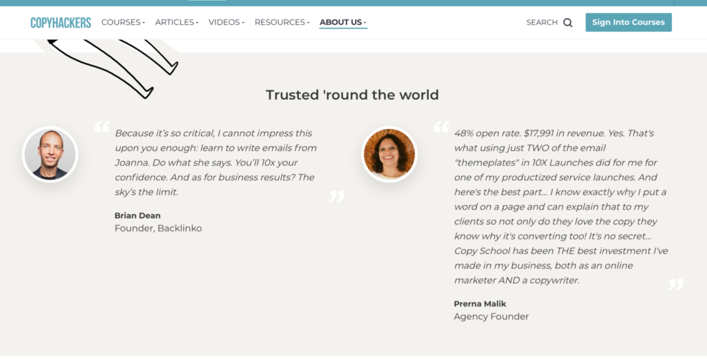
By using testimonials from big industry names, Copyhackers shows prospects that they’re an authority in their niche. They also showcase testimonials that talk about results and numbers, which is a powerful way to build solid trust.
Testimonials are one of the most powerful ways you can build authority for your brand – and the more recent the better. 44% of consumers say that reviews are less relevant after a month, so keeping your testimonials up to date is important.
However, it’s time-consuming to update your about page manually, so automating your social proof is a great way to boost your chances of converting visitors without losing time.
Using a plugin like Thrive Ovation that helps you manage all your testimonials and reviews from one centralized dashboard makes it easy to keep your testimonials up to date and the design optimized.
It comes as part of the Thrive Suite, which gives you access to other features like collecting leads and building email lists. You can try it for $19/month.
Add a Powerful CTA
The last step on EVERY page of your website should be a call to action (CTA), and the about page is no exception.
You should clearly show your readers what their next steps are, and make it easy for them by adding a button.
Elegant Themes has a clear, powerful CTA at the end of their about page:
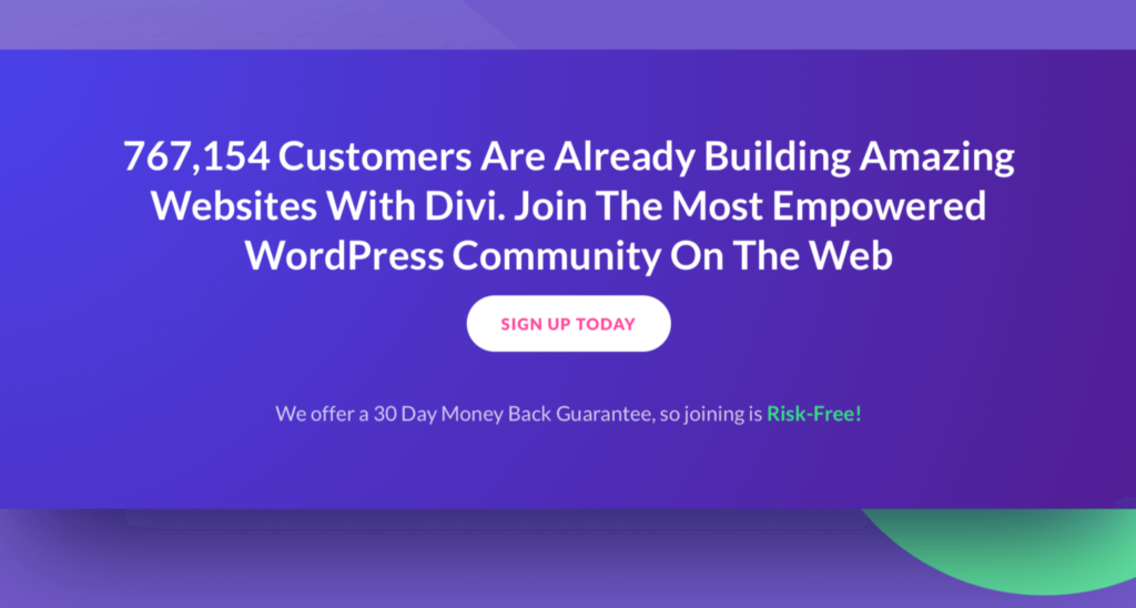
Not only is the CTA clear (“SIGN UP TODAY”) but it’s accompanied by another piece of social proof to push the reader to take action.
Here’s another example from Elna Cain’s Innovative Ink:
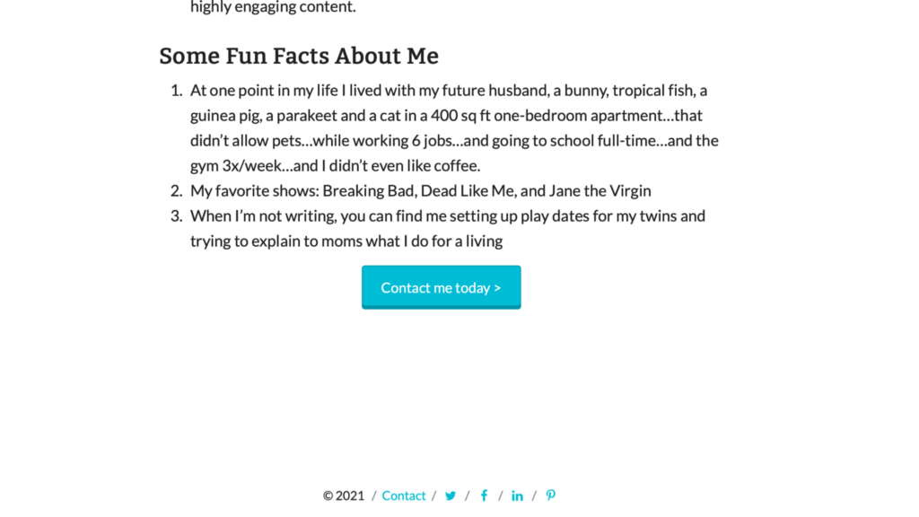
Elna prioritizes clarity here by having one simple CTA that stands out through a colorful button.
Add a Team Section
This won’t apply if you’re an individual, but if your brand has a large team, add a section and introduce them.
Not only does this help you to humanize the brand and connect with the audience, but it also makes you more likable. People want companies that value team members, and showing their faces shows that they matter to your business.
Cosmopolitan has a great example of an about page that focuses on team members:
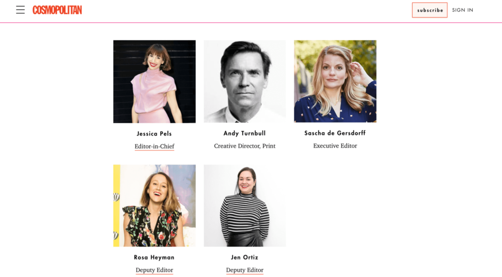
They include the whole team on their about page, which helps feed into their personable and fun brand identity. If you want, you can even include individual profile info for each team member.
Step 3: Optimize the Copy
Once you’ve got a draft of your about page, it’s time to tweak it so that it’s ready to generate leads.
It’s important to keep your visitors in mind, as well as your rankings and world choices.
In order to level up your copy you need to:
Focus on The Reader
Go through your copy and make sure that every line is beneficial to your audience. Does it offer them a benefit? Does it empathize with their pain points? Does it offer a solution?
When you’re telling your story, it’s fine to talk about yourself. But for the rest of the copy, make it benefit-focused – how does it solve your reader’s problems?
Add SEO Keywords
Having the right keywords on your about page can help you rank in Google, especially as your brand gains notoriety.
When we look at the Google results for “Who is Seth Godin”, his about page is the third result:
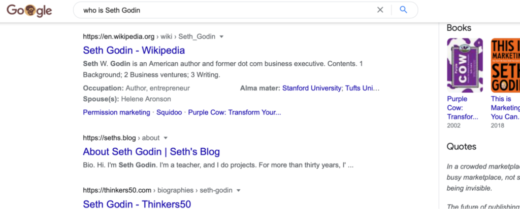
This means that anyone looking for Seth Godin could find him through his about page (which is why about pages are so important!)
About pages are a powerful way to bring in organic traffic, so choose keywords that help you appear in search results in your niche.
Check for Clarity
Imagine that you’re completely new to your industry. Now read through your copy. Does it make sense? Is there any technical jargon that might not be clear?
Something that could be obvious to you won’t be to someone else. Make sure that everything is easy to understand. Especially if you have a service or product that’s new to the market, like a new diet plan or hair product.
Step 4: Optimize the design
Studies have shown that you only have 0.05 seconds for a user to make a judgment about your site. And as important as the content is, the same rule applies to about pages.
If your design is terrible, people won’t stick around to read the content. You need to make it as easy as possible for people to stay on your pages – and as hard as possible to leave!
Like you would with blog posts or homepages, make sure that you break up the text, add images, and use bullet points or lists to keep it readable and engaging.
Here are some ways you can optimize your design and stand out from the crowd:
Add Images
Your about page is there to build a connection with the reader and humanize your brand. Having an image of you, or your team, helps readers make that connection and differentiate you from other brands.
Try to choose a picture that fits with your branding – if you’re a travel blogger, a beachfront selfie is fun and relatable. If you’re a lawyer, opt for a professional headshot instead.
Janet Murray’s about page has a big photo, which builds an immediate connection with visitors:
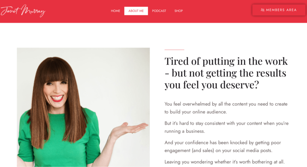
If you’re a bigger business or brand, you can use your logo instead, but definitely aim to include pictures of your team.
Use Color to Your Advantage
Color can have a lot of influence on people’s buying decisions. So much so that simply changing your brand color can transform your conversion rates.
Choosing the right colors on your about page can push visitors to do what you want – whether that’s to buy from you, trust you or sign up for a webinar.
To learn more about how you can use color to influence your audience, check out our guide.
Get Creative with Graphics
If you really want to stand out from the crowd, you can use graphics to keep your audience engaged.
Take a look at how Twitter plays with design on their about page:
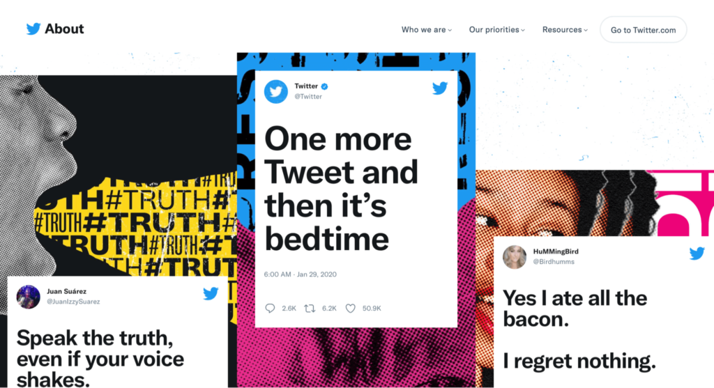
As you scroll down you have shifting graphics that showcase tweets. This helps keep the reader interested, while also cementing the brand and the product.
If your business is in the tech or design space, it’s especially important to have an interesting layout. Users will judge your business by your about page, so you need to show them that you’re dynamic, innovative, and creative.
Consider Using a Video Instead
Neil Patel doesn’t have an about page – instead, he has an about video.
He still follows the same formula most pages do – he tells us what he does, his story, and shows authority with all the awards and partnerships he has – but the video formula makes it even more personal and it connects even better with the audience.
Not only that, but it’s easier for users to stay engaged and it differentiates him from other marketers.
It’s a great example of how there’s no right or wrong way to have an about page, as long as it focuses on the visitors and connects through a story, it works.

