You want a website that looks good, functions properly, and is easy to set up.
Well, welcome to the club!
But what makes things slightly trickier is that you aren’t a coder.
So does this mean you should give up on your dream of having a great website? Absolutely not, especially when we have some truly fantastic website builders.
Case in point: Squarespace.
Squarespace guarantees phenomenal-looking websites, thanks to its beautiful and modern templates. But there’s a hard-to-ignore learning curve involved, which brings me to the point of writing this article.
Below, I’ll give you a step-by-step tutorial on how to use Squarespace to create a beautifully designed and functional website in no time.
What to Expect When Using Squarespace
Squarespace is undoubtedly one of the best website builders on the market. It’s feature-rich and has several modern and beautiful templates that could be a delight for any website owner.
Here’s how you create a Squarespace website:
- Step 1 — Sign Up With Squarespace
- Step 2 — Design the Basic Look of Your Website
- Step 3 — Customize Your Website Homepage
- Step 4 — Optimize Your Website for Mobile Phones
- Step 5 — Create Relevant Sub-Pages
- Step 6 — Make Your Squarespace Website Public
The Good
Squarespace has many things going for it.
As it’s an all-in-one platform, you don’t have to worry about extension or app compatibility. Plus, the knowledge base and customer support cover every potential troubleshooting topic quite efficiently.
Its template selection is contemporary and beautiful, and fully responsive, meaning your site design can adjust itself automatically to appear correctly on mobile devices, tablets, and desktops. You can also edit the templates to customize them according to your preferences.
Squarespace also has a logo designing app that lets you design logos from a list of symbols and typefaces.
Moreover, the website builder takes full care of website security, backups, and redundancy. This takes away a lot of responsibility from your shoulders.
The Bad
The Squarespace interface is slightly more complicated than its competitors. As there are so many features and functionalities, putting together your website can be overwhelming at times, especially where positioning is concerned.
They keep sending you notifications about where you’re going wrong with the editing or that you can unlock a specific feature by upgrading to a paid subscription. But they don’t go the extra step to make it easier for you to make the required move.
The end result? Lots of trial and error.
You also cannot add third-party apps and extensions to Squarespace. Your options are limited to the platform’s range of premium add-ons. As you may have guessed, these extensions—around 20 in number—are quite pricey.
Squarespace is also a pricier option. It may not be feasible for people with tight budgets or those who want to launch a store or multiple websites.
Step 1 — Sign Up With Squarespace
If you don’t already have an account with Squarespace, this is your first step. If you do, you can jump ahead to Step 2. The website builder offers a 14-day free trial, so you can test out the features before subscribing.
Head Over to Squarespace
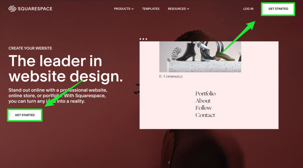
Go to the Squarespace homepage and click on Get Started.
Type in the text about the goal of your sites. This will help you see a customized selection of suggested designs. If you don’t have anything specific in mind, you can always click on Skip to move ahead.
Pick a Website Design Template
Squarespace has modern and beautiful website templates, with every template included in your standard Squarespace membership. In other words, you don’t have to worry about any extra charges.
On the left-hand side of the screen, the template catalog sits neatly organized by niche/purpose. For instance, ecommerce sellers can click on the Online Stores category. Each one of these templates has been optimized specifically to work for online stores.
Browse through these designs before committing to any template. You can also preview how a template will look like with some demo content.
Once you find something you like, click on Start with…, and enter your personal credentials. Click on Create Account.
You’ll be logged in to your new trial site.
Step 2 — Design the Basic Look of Your Website
Squarespace takes you through the whole process of getting your website started. I recommend paying full attention at this stage, so you don’t miss out on any important stuff.
Name Your Website
The first step is to enter your website title. After this, Squarespace will demonstrate how you can customize your site, like editing pages, creating new ones, and styling them.
Add Website Logo
Let’s start with the logo first.
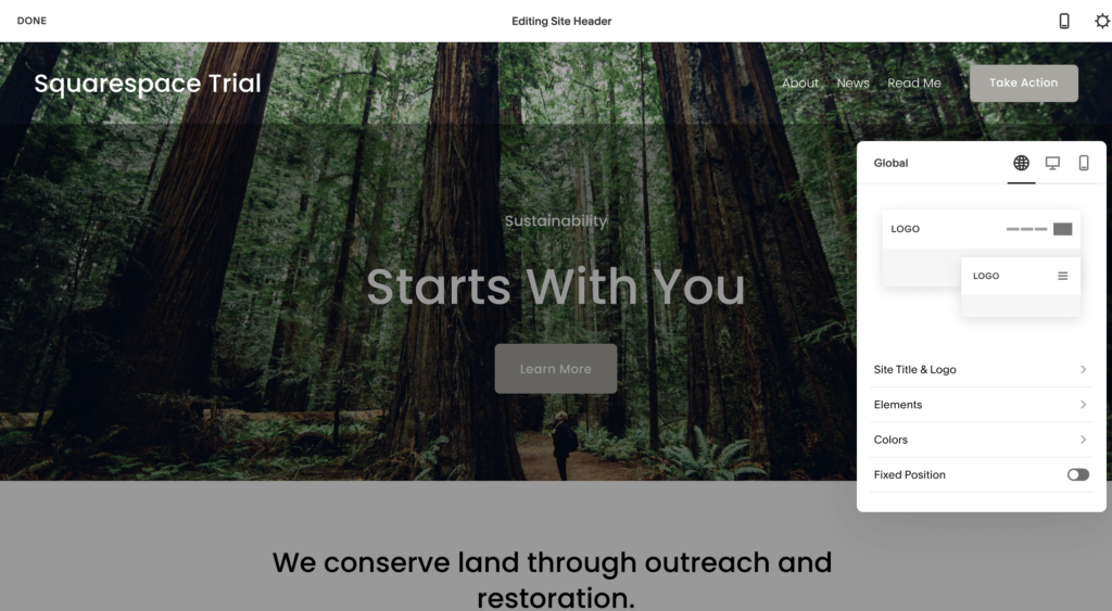
Adding a logo to the site is very simple. Hover your mouse just below Home until you see Edit Site Header. Click on it. Just upload the logo file, and it’ll appear on the canvas instantly.
Don’t have a logo yet? No worries, Squarespace will help you create one.
The website builder has a logo maker tool, along with basic editing features. You can also use stock icons to add to your logo. Alternatively, you can use third-party logo maker tools like Wix, Tailor Brands, and Canva as well.
Save your photo from the tool and upload it to the main Squarespace website editor. Once the upload is complete, the logo will appear on the canvas.
Select Next.
Choose an Appropriate Font
Thought that adding a logo was easy? Customizing your website font is even easier.
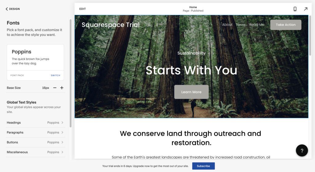
Squarespace gives you specific font pairings that go well together instead of an endless list of individual forms. All you have to do is decide whether you want to choose sans-serif, serif, or mixed fonts, which will save you lots of time.
Go to the main dashboard, and select Designs. Click on any font pairing to see how it looks in the Preview section. Additionally, you can adjust the base font size.
Select the font pairing you like, and click on Next to proceed.
Pick Your Website Colors
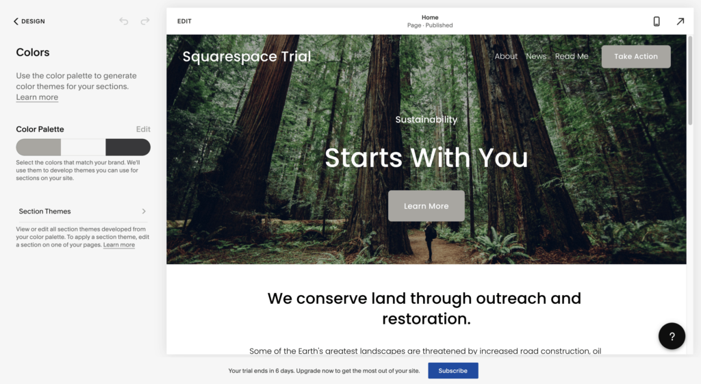
Color settings are similar to font settings. Again, Squarespace lets you pick your colors from the set of designer palettes (a set of colors that match) instead of choosing individually one by one. They are presented as groupings of three colors:
- The primary color (this is for standout elements on your page, such as links, buttons, and other similar elements)
- The background color
- The secondary color (for secondary backgrounds, links, and so on)
Considering these palettes are put together by a professional designer, you’re guaranteed that everything will look good on your website, plus save time. You can also put together a custom palette if you want.
Choose a color palette that suits you best. Click on Done to finalize these changes.
You’ll now see your logo, fonts, and colors added to your website.
Step 3 — Customize Your Website Homepage
You can customize your homepage and replace the demo content with your own.
Squarespace divides all your content into separate rows. Here’s how your homepage design will look before you customize any aspect of the website:
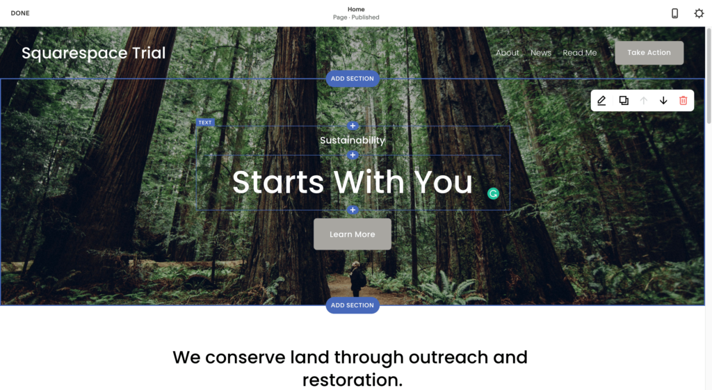
Your website will have three different rows:
- The menu row
- The hero section row, which includes the image and the headline on top
- The text section row that is the lower part of your website
Every row has different options and customizations available. Hover your mouse over any element on the page to see options pop up. This can include replacing the logo, adding extra elements, and changing the header layout.
Select the Edit button located at the top of the canvas. A visual website editor will crop up on your screen, where you can modify any element on the page, including adding and deleting options.
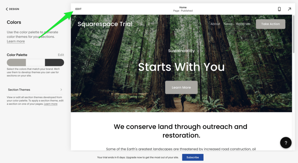
Keep in mind that any text you add or edit is saved automatically.
Deleting Website Elements
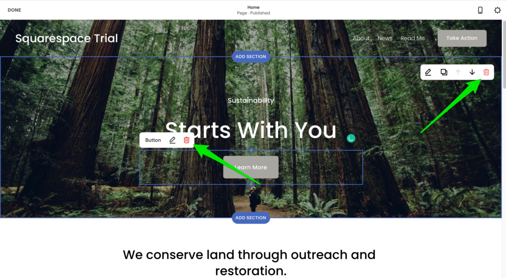
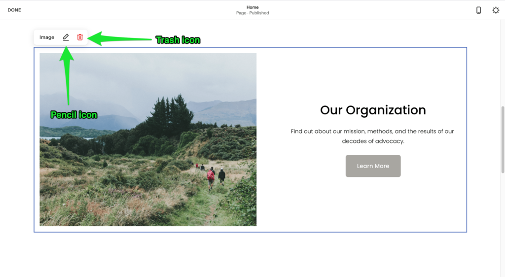
You can remove a whole row or any individual element. Simply click over the part you want to delete, and click the Trash icon.
Opening ‘Options’ Panel of Elements
Your website design consists of elements that have their own options panels. To access these panels, click on the Pencil icon on the upper right-hand corner of the element in question. This will show you a set of additional options for the specific section.
![]()
Every element will have a different set of options concerning formatting, backgrounds, colors, and alignment. For instance, here’s how the additional options for the Hero row will look:
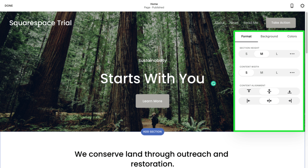
You can adjust the look for every row by clicking on the displayed options.
Adding or Realigning Website Sections
You can add a new section as well as realign existing sections.
Adding new sections lets you accommodate any new content that you want to include in your pages. Pick the spot where you want to add a new section and click on the corresponding ‘+’ buttons you’ll find before and every content section.
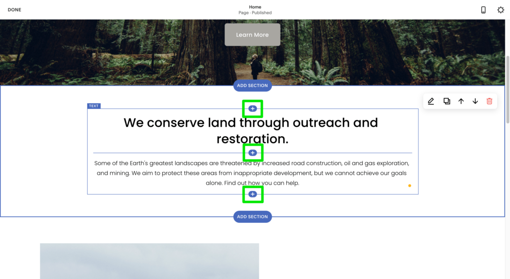
In addition to adding standard content sections like headings, images, and quotes, you can also add specialized fields for appointments, reservations, newsletters, FAQs, restaurant menus, and more.
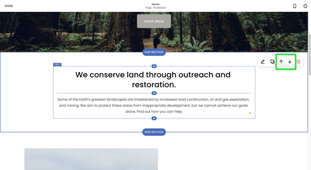
Squarespace also allows you to realign sections by dragging around individual elements and dropping them into another place on the canvas. You can move sections up and down or use the arrow button in the top-right corner of a given row to switch between sections.
Adding Images and Other Visual Elements
Squarespace has templates for image gallery blogs, single videos and images, charts, and music.
Important: Click on the ‘+’ button next to where you want to place that content to add new content to your site—in this case, an image or video.
If you click on Images, you’ll see a selection of different layouts for image presentation. Click on the Pencil icon next to the image you want to replace and then on the Trash icon. You can also upload an original image if you want.
But that’s not it.
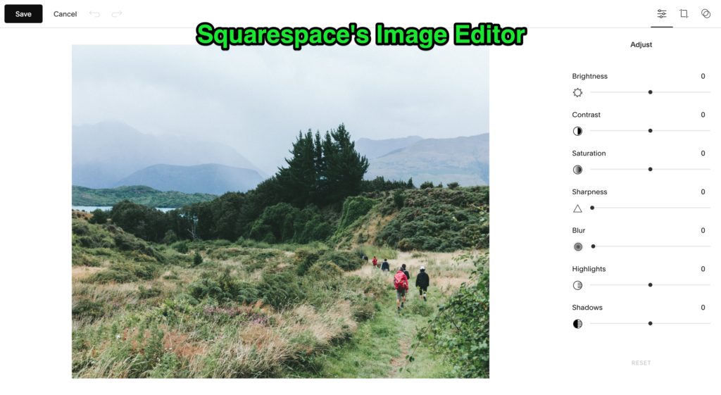
Squarespace offers editing tools that let you edit your image and change some of its parameters. Click on the Image Editor button to crop, flip, add filters, change the aspect ratio, and adjust the image’s brightness, contrast, and saturation.
Step 4 — Optimize Your Website for Mobile Phones
An unoptimized website can seriously harm your traffic and conversions.
Why? You see, it’s more likely for users to visit your website from a mobile phone than a laptop or desktop. Mobile traffic has increased to more than 200% in the last seven years.
Luckily, Squarespace makes mobile optimization super easy.
It has a clever mechanism that predicts what the best mobile layout for your website design should be. As such, you don’t have to worry about mobile when using this website builder.
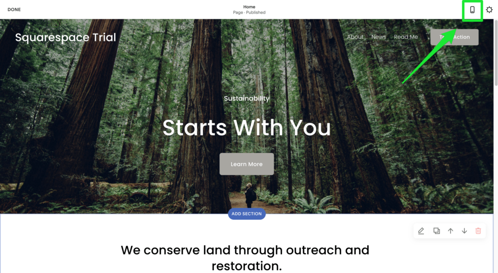
Click on the Mobile Phone icon in the top right-hand corner of the Squarespace interface to view a preview of the mobile version of your site.
Adding Extensions
Squarespace already has plenty of features and abilities, but if you want to extend it further, you can choose third-party integrations as well. For instance, you can add your preferred accounting software or an email marketing tool to your site.
Select the extension you want to add to your site, and then click on Connect to site.
Step 5 — Create Relevant Sub-Pages
Squarespace users generally want to build more pages than the homepage. This can include the About page, Team page, Contact page, and Privacy Policy and Terms of Service page.
Add a Blank Template
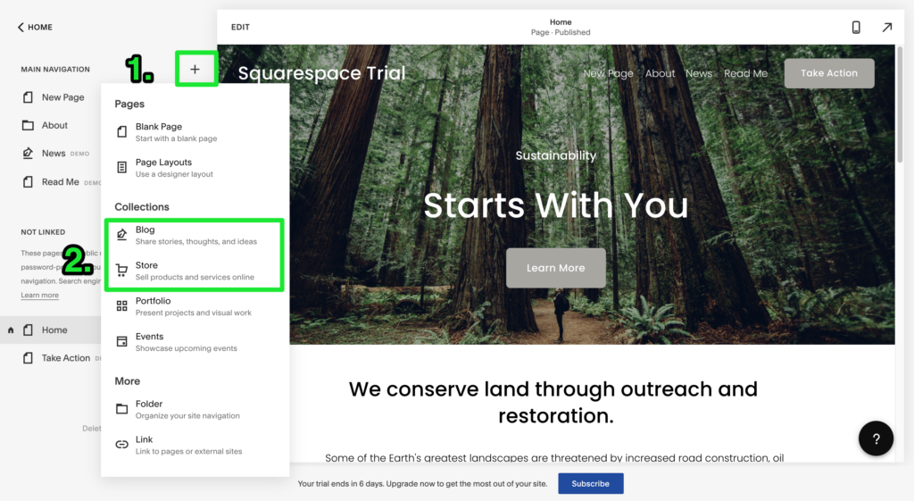
Go to the main Squarespace dashboard to add a page. Select Pages, and then click on the ‘+’ button. You can click on either the Blank Page template or Page Layout.
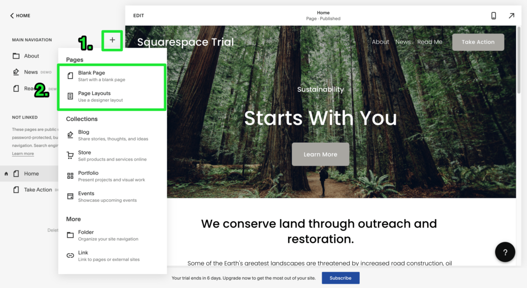
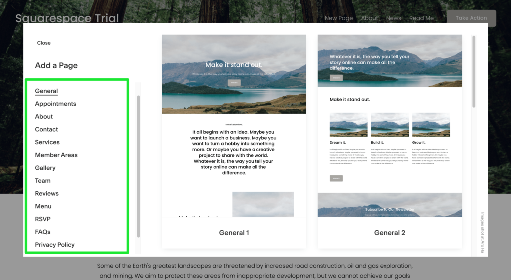
Suppose you click on Page Layout. After this, pick the category of the page you want to build and then select a specific page layout.
Customize Main Menu
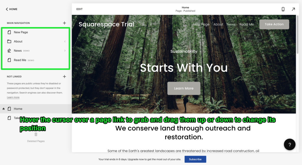
Every newly added page is automatically added to the main menu of your site. But you can tweak things to make the menu look precisely how you want it.
For customizing your menu, you’ll have to go back to the main Squarespace dashboard. Select Pages from there. You can then grab any of the page links in the sidebar and drag them up and down to place them where you want.
Adding Optional Pages
You can add a blog or an online store to your website at this stage. Both are optional, so only proceed with this if you really want to add them.
Click on Pages on the Squarespace dashboard, followed by the ‘+’ button in the sidebar to add a new page. Select Blog or Store according to what you want.
Step 6 — Make Your Squarespace Website Public
Your Squarespace website is private at the moment. If you want to make it visible to the outside world, you have to activate it.
Here’s what you need to do:
1. Go to the main Squarespace dashboard.
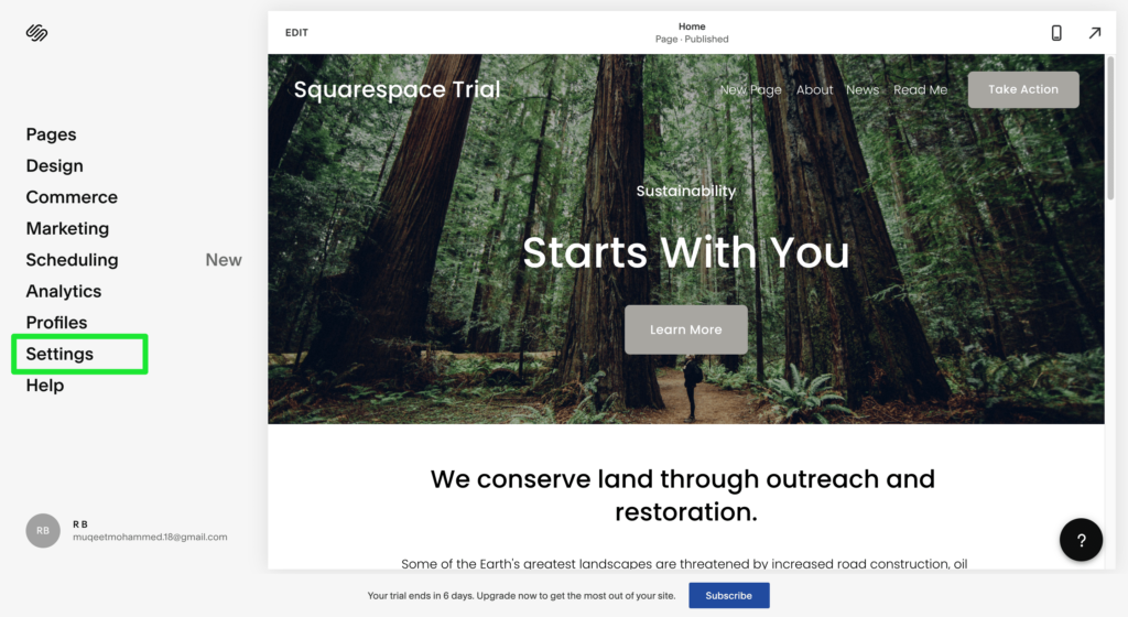
2. Select Settings, followed by Site Availability.
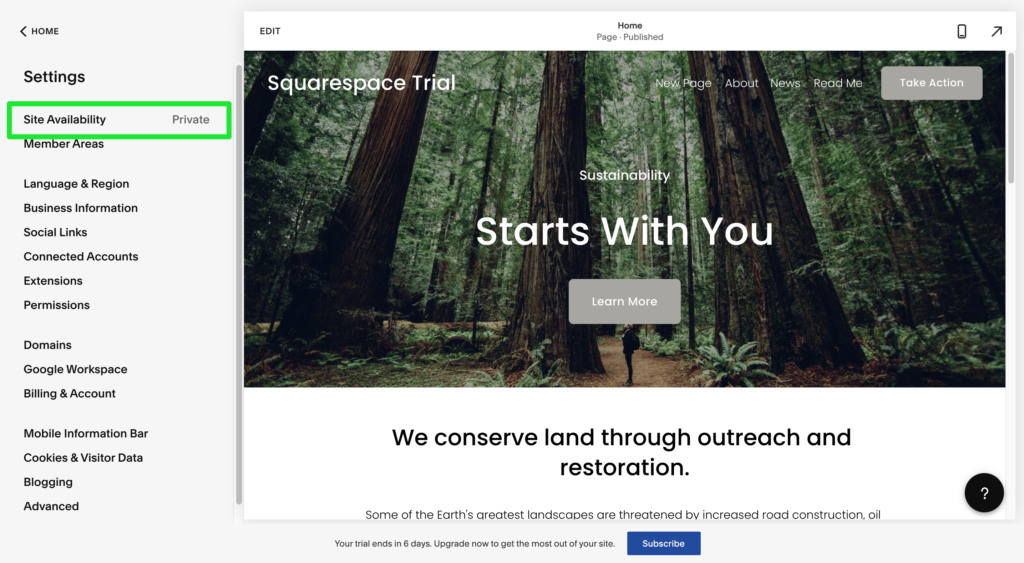
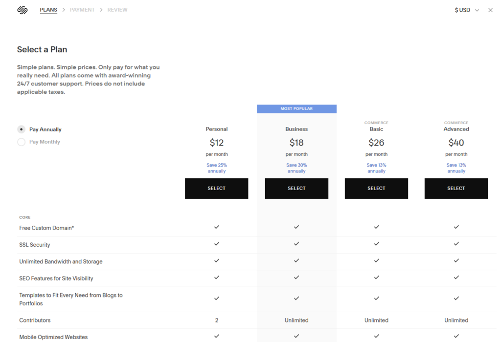
3. Upgrade to one of Squarespace‘s paid plans to launch the site.
Choose the Right Subscription Plan
I recommend opting for the personal plan that starts at $12 if you plan on building only one website. However, if you want to run an e-commerce store, the Business or Commerce plans would be a better fit. Compare plans to find the best one for you.
Also, every plan comes with a free domain name, so you don’t have to pay extra.
You know what? You now have a live Squarespace website that’s available to the public. Well done!
